

Your audience is increasingly time-pressured nowadays, and this is in part because we receive more information than ever before. Some sources say that the numbers are as high as 100,000+ words per day and this doesn’t include what people consume at work!
Effectively communicating your message, whether it’s to the public, your senior management, or other stakeholders of your project, is so important in public health.
As a public health professional, how do you effectively communicate with your audience when they are already being bombarded with so many words throughout their day?
That’s where infographics come in.
When you can use pictures, in combination with carefully selected text, you have a higher chance of grasping your audience’s interest, to then engage them. With that engagement, you can communicate your message much more effectively.
We have all seen the rise in popularity of infographics in public health; it is quite evident and noticeable (for good reasons). And, so it’s no wonder public health agencies are using infographics as a medium to communicate with their audience.
“Infographics” are even being taught as part of certain curriculums (I recently also gave a talk to an undergraduate class as part of their assignment); and journals are dedicating space on their site to summarize articles in infographic format (so cool!) – check out the British Medical Journal and the Journal of Public Health Management and Practice.


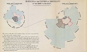
And, as you probably already know, summarizing key information in a visual format is not a new concept for public health. Visualization of information has been seen as far back as the 19th century in a number of important work including Florence Nightingale’s ‘Diagram of the causes of mortality in the army in the East’ (1858) and John Snow’s “Broad Street Cholera Outbreak” (1854).

From the 1800s, till this day, using pictures in combination with text, has shown to be an effective way of communication in public health. By grasping the interest of your audience, and then engaging them in good content provides a path to communicate your message much more effectively.
So, next time you need to communicate with your audience, consider using an infographic to focus your message and deliver it using this effective method.